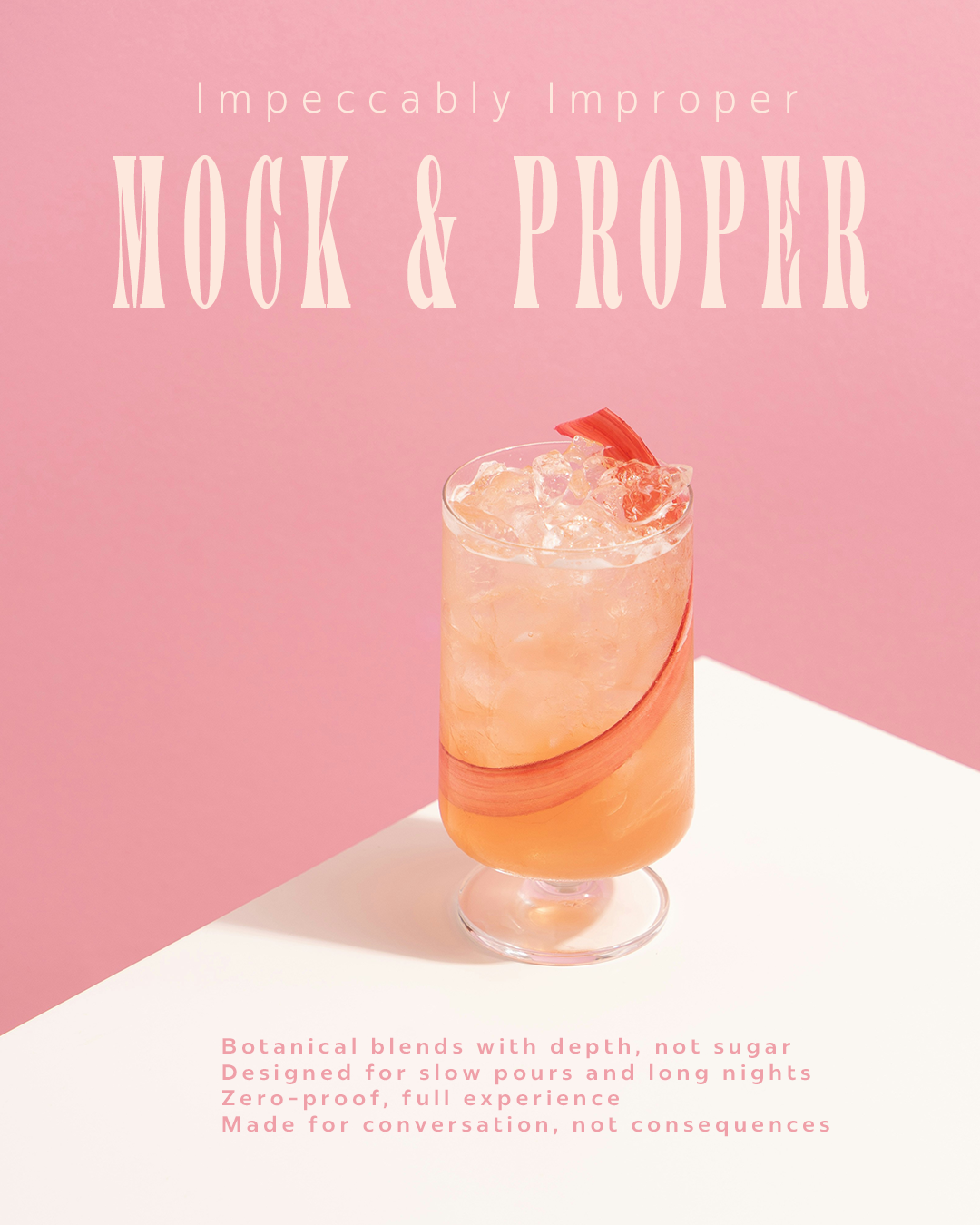
This piece was designed to communicate a shift in perception around non-alcoholic drinks. The visual direction uses soft gradients and clean space to create a sense of calm and sophistication, while the copy emphasizes experience over restriction. The layout prioritizes hierarchy and readability in a social format, guiding the viewer from brand to message to product with clarity.
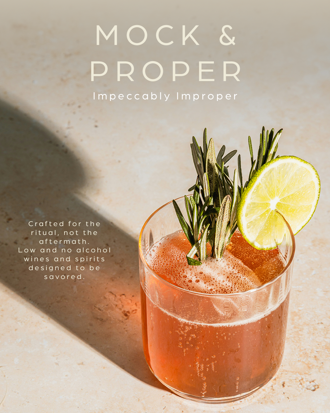
This piece explores how visual tone can shift perception around non-alcoholic beverages. By combining warm, natural lighting with a minimal layout, the design creates a sense of familiarity and quality. The hierarchy guides the viewer from brand to message to product, reinforcing clarity and ease of engagement in a social format.
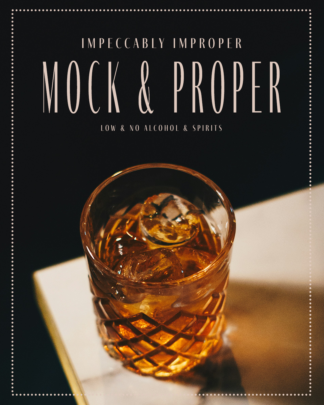
This concept explores the evening side of Mock & Proper, positioning non-alcoholic beverages within a more intimate, elevated setting. The darker palette, warm highlights, and structured framing reference classic cocktail culture while maintaining a modern, restrained feel. The design reinforces the brand’s balance of refinement and play, presenting a zero-proof option that still feels intentional and indulgent.
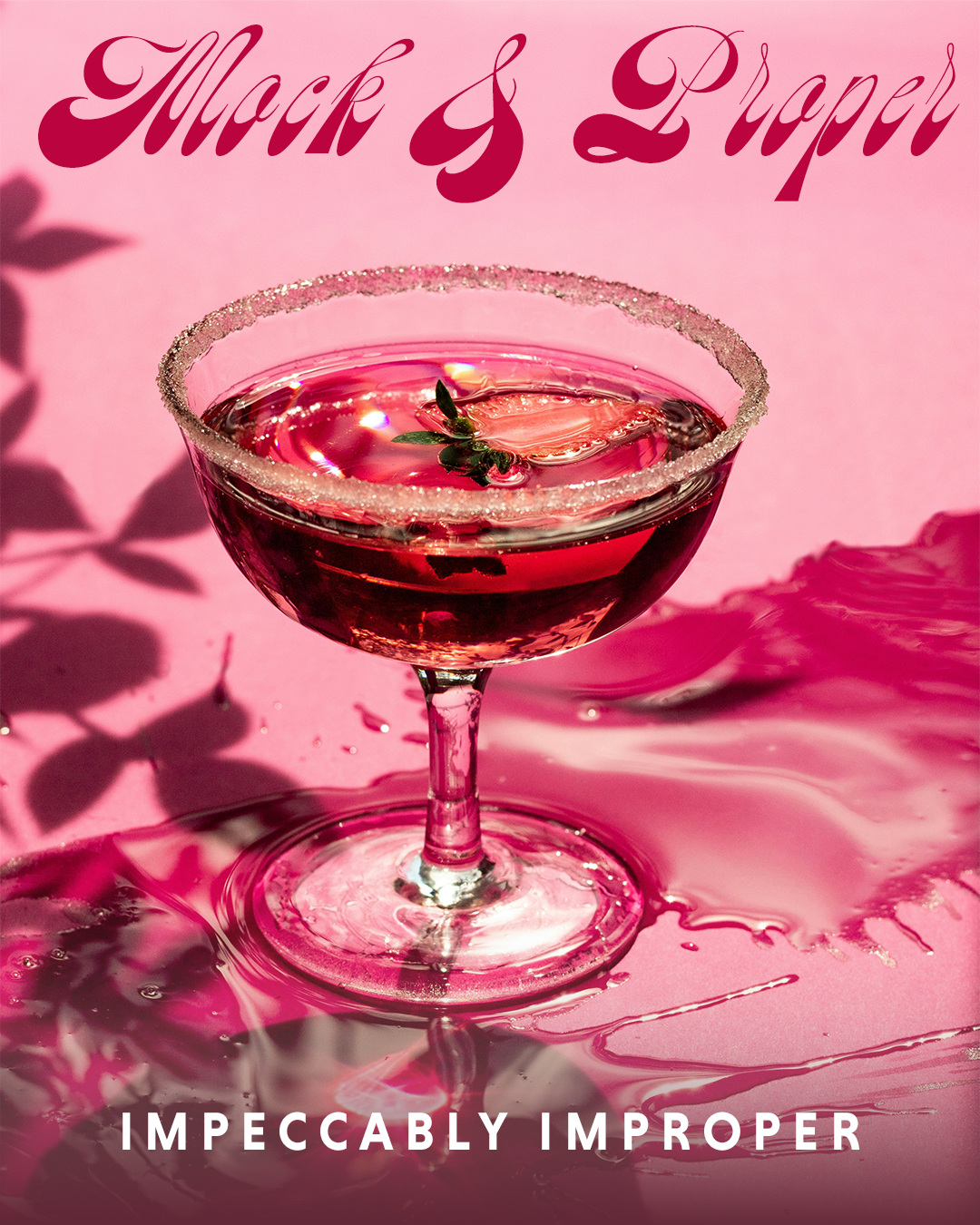
This concept explores a more playful and expressive side of Mock & Proper, leaning into bold color and high-energy composition. The saturated palette, fluid textures, and stylized typography create a sense of movement and spontaneity, reinforcing the idea that non-alcoholic drinks can still feel vibrant and social. The design contrasts the brand’s more refined direction, adding range while maintaining a cohesive identity.